Brickwork

After being given the challenge of taking five consecutive photographs of brick by my friend Sarah a couple of weeks ago. I realised that I haven't talked about brick or brickwork which seemed a little strange considering it has been so prominent within my practice for a couple of years now, and along the way I have been gathering some interesting images of different brickwork where and when I see it so I thought I would share them.....

I want to draw attention to how varied and fascinating this material can be. I think it is often overlooked or unnoticed because we are so familiar with it being used for domestic housing.
It's the oldest building material around it is dug from the ground, brick factories are located right next to clay pits so they can be in close proximity to extract the clay from the ground.

 Different regions have different clays running through, Stoke and Bristol is Red. London clay has quite a lot of lime in it making it yellowy grey. Sussex clay is grey. Every clay has a different quality. Creating various surfaces firing temperatures and coloration's. It's a material that can undergo extreme changes from colour to form it heats up in the sun and cools in the cold. It's incredibly versatile as a building material and allows any scale structure to be built. That's probably one of the main reasons why I'm fascinated with it and continue to be so. 

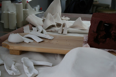
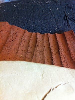
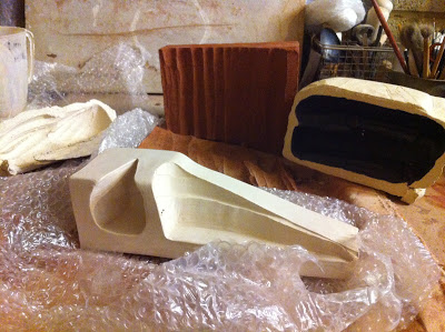
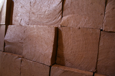
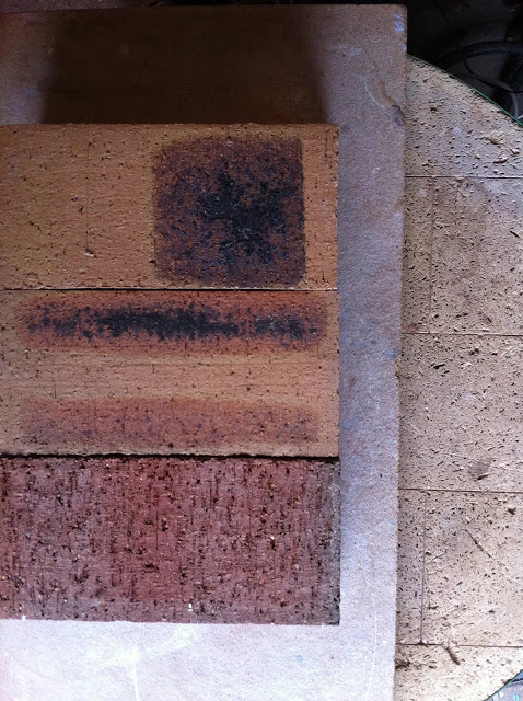
The two images below are examples of my own work fired and unfired brick this is the back of Pause which can be seen in Lady Margaret Hall in Oxford. This is a Cheddar Red brick made in Bristol at Ibstock's Specials Department.


Here is an exquisite example of brickwork and has to be one of my personal favourites Giles Gilbert Scott or known for designing Liverpool Cathedral, The William Booth Memorial Training College on Denmark Hill and Battersea Power Station. Shown below is the facade of Tate Modern on Bankside designed 1947-1960 and comprising of approx 4.2 millions bricks his signature linear design work is unmistakable. 


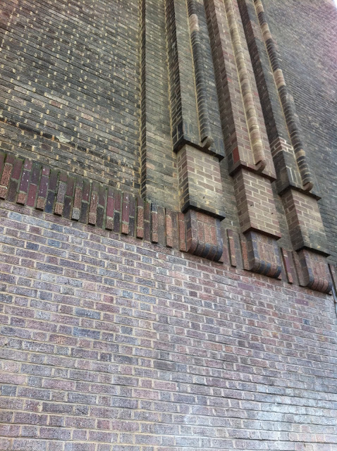
The three dimensional quality achieved through layering also captures the aesthetic of the period it was designed it represents modernity. Built during a time Specials Departments within the brick industry was thriving. The rounded edged bricks and bullnose bricks would have all been made by hand within moulds.


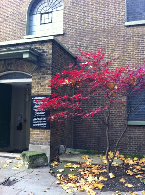
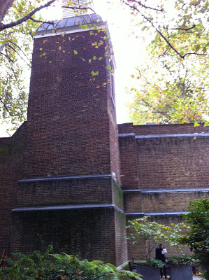
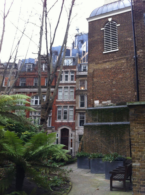
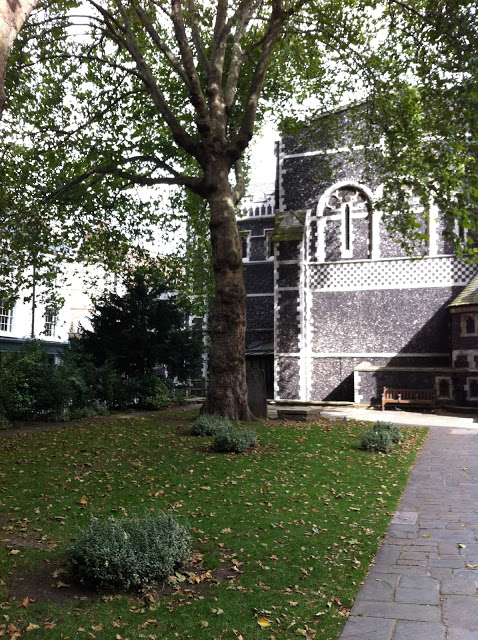
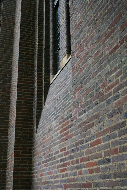
This image shows Giles Gilbert Scott's work in Lady Margeret Hall Oxford, this beautiful brick building is the colleges chapel. Again it's clear to see the style is reminiscent with the rounded edges framing the long slim windows but what I adore about this particular building is the subtle curve that moves into the elegant bulbous base something we don't often see within brickwork. I think we have become conditioned that brick is straight and somewhat rigid in it's form but that really isn't the case. 


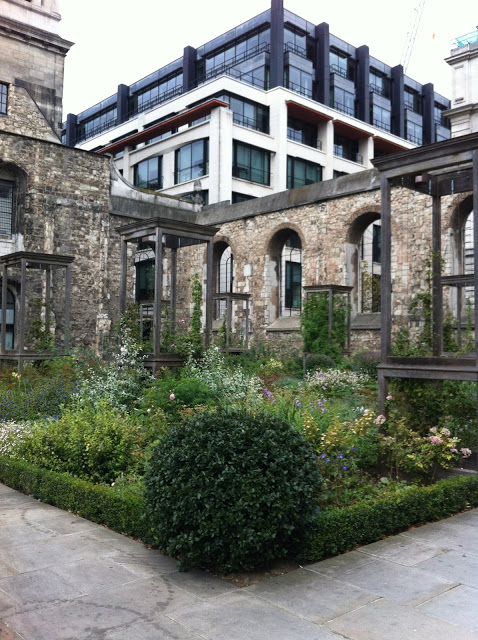
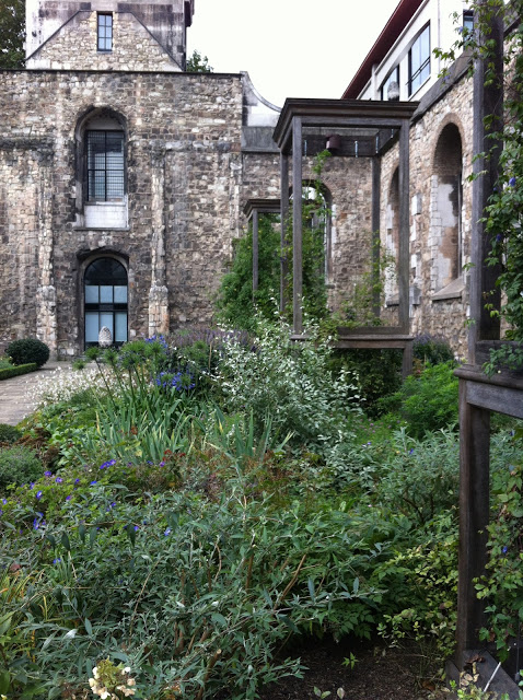
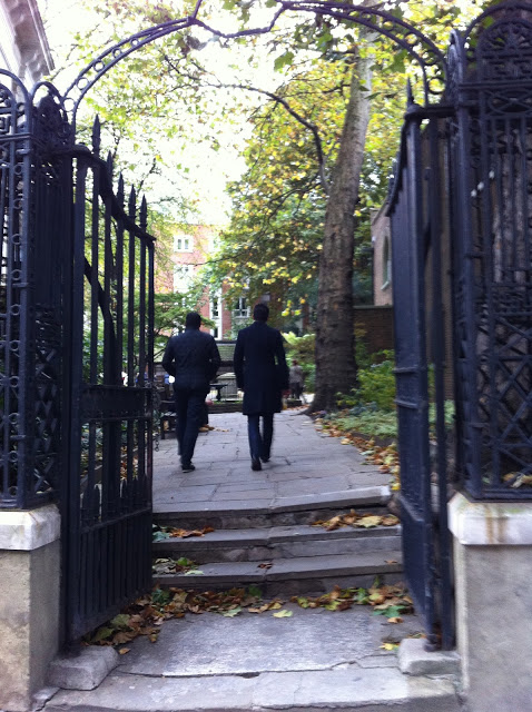
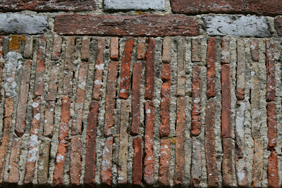
This is a section of brickwork of a church in Romney Marsh these bricks are very narrow compared to the standard domestic brick we are used to seeing today. Mortar can also completely change the overall appearance of a brick in this case they both become equally important to the aesthetic.


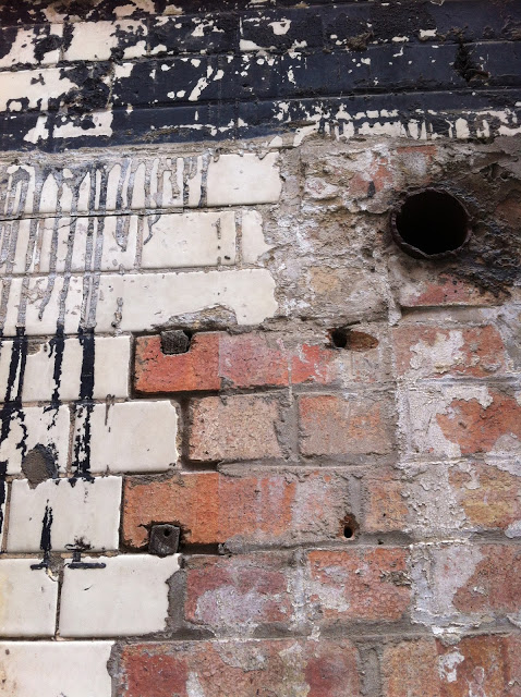
Milan quite different in style to much of England's brickwork the small holes within the walls have been created by leaving gaps this has been used in some contemporary buildings as a way of allowing light into the the interior space.


This wall can be found at the back of the Oxo Tower in London. The reason this caught my attention was the bricks looked as though they had begun their life glazed and over time this has eroded away leaving this interesting surface quality of rough and smooth light and dark. 


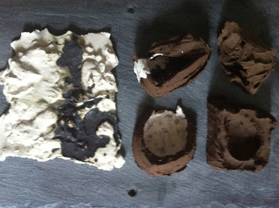
I rescued this collection of bricks from Ibstock whilst working there. The imperfections during firing was the reason they were being thrown away and also the reason they made their way to my studio. They were far to unusual to end up in the bin and the fact they reminded my of Rothko's paintings another reason I gave them a home.


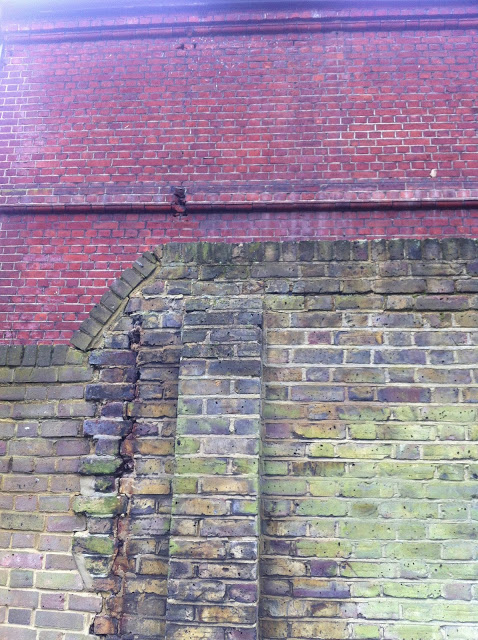
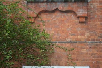
Brick wall in South London 


Three types of brick in South London including this beautiful Edwardian red with bevelled edges. 


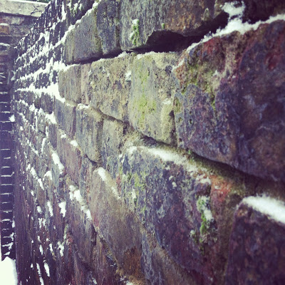
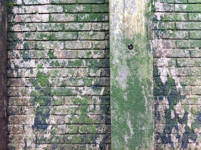
Mossy brick wall in Wapping next to the river.


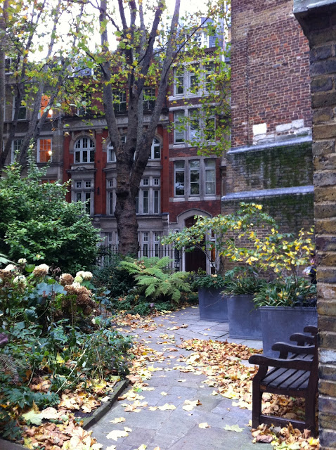
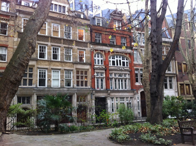
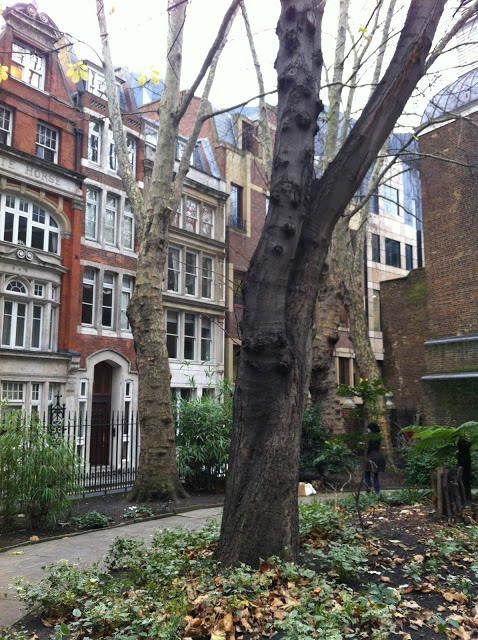
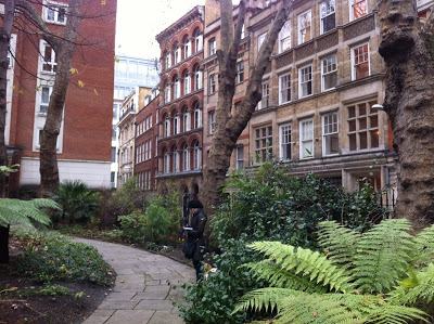
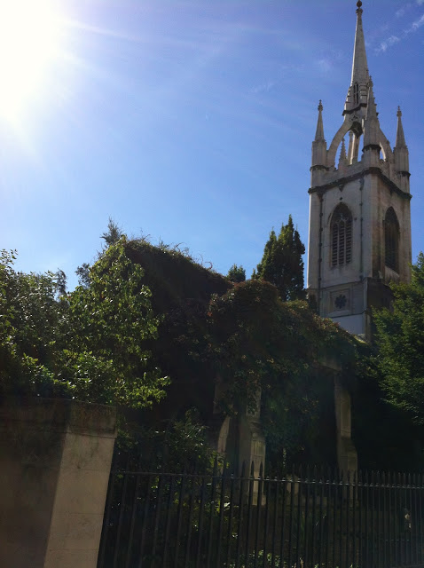
Red Edwardian brickwork in Lady Margaret Hall Oxford this was one of the reasons Pause had to be made from red brick. In order to create a narrative between site and object.
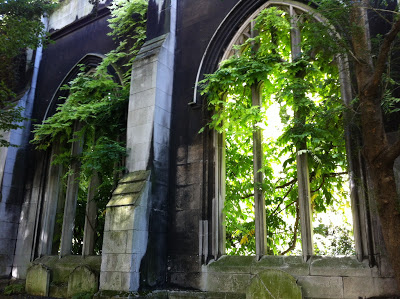
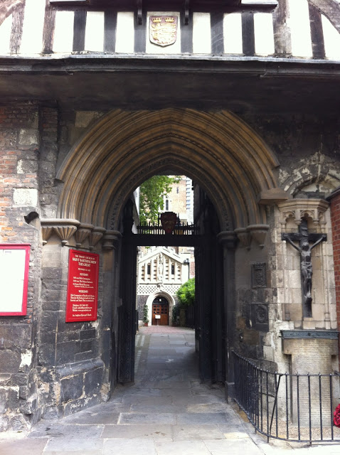
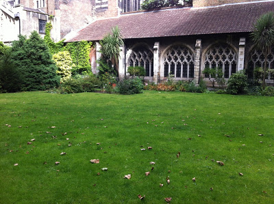
this college is also rich in different style and age of brickwork.


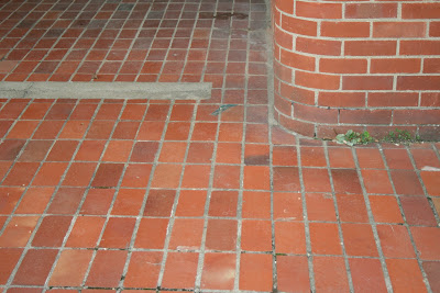
Brick wall and floor 


The new Student extension within Lady Margaret Hall these are contemporary hand made bricks. 


Check out my Pinterest page I have a board dedicated to brick showing examples from all around the world. http://pinterest.com/kimnortondesign/brickwork/

Images from the train part 2

During the past week or so I've been darting around between London, Oxford and next week Plymouth for the First Crafts Council Cohort meeting. 

With the cold January frosts I've gathered more images of my journeys across the countryside from the train. This is part two I suspect this series will continue throughout the changing seasons as I'm so what hooked.

As I've been recently gathering imagery I've noticed on a completely subconscious level that I'm being drawn to a more minimal aesthetic.
Once again the colour palette within this collection of images has a quality of simplicity.
It's not falling in to monotones but there is a subtle wash of pale shades and tones.
Winter has this special quality devoid of brightness through vibrant colours but when the sun shines across a white frosty landscape in the depths of winter it always astonishes me how beautiful winter can be. 


Chelsea Fringe site approval

Well it's a good start to 2013 we have confirmation from the City of London that our proposal for the Chelsea Fringe has been approved and the Church have also given us the go ahead.
Which is fantastic as it's now becoming a reality after 9 months of preparation including meetings, site visits, proposals, and numerous conversations. The real work can now commence !!!!! 

There are a few final details to sort out but this means we can begin seriously working on the design construction. 

Just before Christmas we visited the SCIN Gallery in Old Street www.scin.co.uk to search through the materials library in the hope of finding something that would work not only aesthetically but also needs to be weatherproofed and fire resistant, whilst still maintaining an element of fluidity and weightlessness.

Here are a few examples we short listed 


They are light weight, transparent have a similar quality of silk but can used for large scale work particularly architectural projects. It's all sounding perfect, There are specific fabrics that can be used for exterior projects and this is what we are in the process of try to investigate as the supplier is in Switzerland. Otherwise we could look at weatherproofing a cotton based fabric but the strength wouldn't be there in the same way as something that is metallised. 

Here are a few initial sketches Sasha has been working for the final installation.....
I'm sure there will be many new renditions of this idea once we begin working on 1-1 scale material tests. It's always at this stage you immediately begin to understand where the strengths and weaknesses are within the design.


Images from the train

I seem to spend most of my time travelling particularly by train. It's a long standing joke to my friends and family whenever I make or receive a call I'm either on the train about to get on the train or waiting for a train.

So I thought I would post some photographs from some of my various journeys across the countryside.

Last week during the cold frosty mornings I was in my element. The light quality was really interesting capturing snippets of the landscape, whilst moving captures a more abstract image and the colour palette here quite subdued.


I often enjoy simply switching off and watching the landscape change throughout the journey 
mornings are fantastic as there is always an element of anticipation lingering in the air as everything is new and about to unfold. 

These were taken several days later after the frosty spell still very cold but there is a little more colour despite being in the depth of December.


part three 


Christmas Winter window for Karavan-Eco 2012

Yes it's that time of year again my second Christmas or Winter window for Karavan-Eco in East Dulwich.

This year I was going for a simple design that hugged the edge of the two windows leaving a good space available for the products to be clearly seen and displayed. 

I decided to go with the essence of winter woodland which would accommodate my usual scribbly style of drawing perfectly. 


After many different renditions, colour options and compositions I resorted back to my initial idea and kept it black. The thought of adding too many colours would have overly complicated the entire design and there is a crispness to the overall appearance as it has been so intricately cut. This is an aspect of the process which is very difficult to visualise when you are working on paper. Trying to understand and interpret how thick the drawn line will scale up to, will it be too overpowering or simply be lost when standing from afar.


The Images taken in the evening show the design with a little more clarity I will be adding final design drawings to this page in a few days so there will be more of a transition between the each process involved.


St Botolph-without-Aldersgate London

In my last post about the Postman's Park I mentioned wanting to go inside the church to see if we could gather any more information for the Chelsea Fringe proposal.

Last week we had a meeting with Richard Bray the Curate there to discuss our ideas and make ourselves known to the church and to take a close look at the space.

 We now find ourselves writing another proposal so everyone concerned is kept in the creative loop and managed to collect a few images along the way.

 It was such a surprise from the outside as it looks a little unapproachable with grids up at the window however, once you step inside it's a completely different story. 


St Botolph-without-Aldersgate the current building dates from 1780's the original building is thought to have been built around 1050 unlike many of the surrounding buildings managed to escape the fire of London. 

We were surprised by the quality of light particularly coming through the very top windows. The tiled floor was stunning and detailed ceiling off set the dark wooden columns and seating. 

The visit has definitely helped us solidify our ideas with the possibility of using both inside and outside spaces. 


The organ was built in 1778 and is the only green organ surviving in the city.


The Postman's Park London


Last week Sasha and I went over to the Postman's Park  together to take a closer look at the layout and possibilities open to us for the Chelsea Fringe Festival. We are currently in conversation with the City of London about the logistics of siting our work here during the event but until we have officially confirmed this the design still remains sketchy.

In projects such as these everything has to move along in a particular pattern. Although we do have some idea what we want to achieve we can only develop the concept so far until we definitely know which site we will be responding to. Until then the best way forward is to try and gain a good understanding of the space.

The first time I visited the Postman's Park was probably about a month ago it was interesting to see how dramatically it had changed within that short period of time. The leaves had dropped quite quickly and the feeling of Autumn was heavy in the air. It was a cold and slightly darker day. Sasha'a previous visit was a lot later on the day and it was beginning to get dark so we are gathering plenty of imagery to be able to move forward. 

One feature we are both focussing on is the idea of the pathway and this space has so many options. The grassy mounds are quite organic in form. Nothing here is formal and rigid there are plenty of different routes around the park some open and others fairly secluded. One side is overlooked by offices the other side by housing. The church also sits at one end which is a sturdy brick structure I'm still yet to go inside. Last week it was locked and the previous visit there was a service. Maybe next time!! 
We have to take a look as I think that will also give us more to think about and consider.


December 

 Our visit earlier this week we wanted to document the park in full winter mode.

Firstly we met our Fringe co-ordinator Jane Merrick who has been appointed to help us along the journey but also to make sure the project happens. 
We also used this opportunity to begin taking more detailed dimensions of the space and the areas in-between the five main trees planted there.


The space felt bigger because all the leaves had completely fallen leaving a wonderful structural quality to the larger established trees.
It did however, allow us to look at the space in a more analytical way for the first time it was possible to see what we have to work with. The points we need to use to hinge the form from, the height, the contact or non contact with the floor and how that would work with the ideas surrounding seclusion and quietness.


Crafts Council Hothouse selection.

 I'm thrilled to have been selected for the Crafts Council's Hothouse 3 programme beginning in January 2013. 
I'm one of ten within the South West Cohort. We will be partly based in London, University of Plymouth and Bovey Tracey throughout the six months for Cohort meetings and presentations. 

Follow the link below to take a look at the press release.

www.craftscouncil.org.uk/about-us/press-room/view/2012/hothouse-south-west-makers-selected/

All ten designer makers are listed so follow links straight to their own websites.
The south west cohort is the first group to be announced there are three more groups to be selected in the following weeks which is very exciting !!! 

Follow the links below to view the three other cohorts selected 


www.craftscouncil.org.uk/about-us/press-room/view/2012/hothouse-east-makers-selected/

www.craftscouncil.org.uk/about-us/press-room/view/2012/hothouse-north-makers-selected/

www.craftscouncil.org.uk/about-us/press-room/view/2012/hothouse-london-makers-selected/

MA Victoria and Albert Ceramic Residency 2010

I thought this would be interesting to include as the Victoria and Albert Residency is shown on my website but it's a somewhat edited version of the work achieved during our time there. During my first year at Central Saint Martins five of us all exploring different strands of ceramic practise and research were fortunate enough to spend 3 months working in the new ceramic studio within the ceramic gallery space on the 6th floor. Not only that but we were the first ever group to work in the newly opened space, our neighbour in the other studio was Steve Dixon who was the artist in residence for six months developing his new work body of work inspired by the galleries collection. Whilst we were there we had to open the studio up for visitors to be able to come in and chat with us and give them the opportunity to see what we were working on and how we were working. The entire space has a glass frontage so you had a feeling of being on display at all times. 

Throughout our time there we thought it would be interesting to document our journey through a blog


Here's a link we have all contributed maceramics.blogspot.com 


And a few more images that haven't already appeared, taken during the easter holiday. Anne came in to do some models making for her furniture collection and Michelle was preparing for her final exam so these were her last firings for her final collection. 


Green Spaces in The City of London

During the past couple of weeks I've been walking in and around the City of London exploring green spaces in preparation for possible sites options for the Chelsea Fringe Festive next year.

St Dunstan in the East
I fell in love with this space whilst searching for a home for Experiential Spaces and thought I would revisit it once again to see if it could work for the Fringe. What's left is the exterior walls of a medieval building which was destroyed during world war two bombings. Once again we see these spaces being used by the local workers as an opportunity to step out of the working environment and spend a little time outside. It's such a wonderful place the quality of light is stunning and the trees have also inhabited the interior and exterior perimeters. 


The following three sites I continued with were all in very close proximity to St Paul's Cathedral.
The first spot was Christ Church Greyfriars Garden on King Edward Street. This sits on the 13th century site of the Franciscan church of Greyfriars. Unfortunately it was destroyed in the great fire of London in 1666. It was rebuilt by Wren and once again destroyed during the second world war bombing in much the same way as many other buildings in and around the surrounding areas.

What exists today is a beautiful scented garden which mirrors the original structure of Wren's church, and is huddled in-between two main roads.

Although I really liked this space Sasha and I both agreed that it's already a fully established space and wouldn't really benefit from any kind of intervention. 


The Postman's Park 
Also on King Edward Street and a moments walk from Greyfriars Garden. This was quite different in atmosphere and the structure of the space. It was originally two grave yards and there are also two entrances in and out of the park. It's perfectly positioned as you leave the park from the opposite end you are immediately confronted with the Museum of London.


It's known as the Postman's park as it used to be a popular place for the post office workers to spend their lunch. It's now known as a memorial garden for those who died in heroic acts losing their life to save others. 


St Bartholomew's the Great
Sits in West Smithfield very close to the Meat Market. It was founded in 1123 as a Augustinian Priory. Unlike Greyfriars Garden and St Dunstan in the East over on St Dunstan's Hill this site survived the great fire aswell as being untouched by the WW2 bombings. 


It's a relatively small space with two sides sitting on different levels. The back of the church runs along Cloth Fair during the medieval period cloth and fabric was bought and sold here.
I instantly found that fascinating particularly as we are considering the use of fabric within the final design. 


Sasha and myself plan to walk these spaces together next week, We thought it would be interesting to initially visit the spaces separately so we would be able to discuss our thoughts without the distraction of one other's opinions on the first visit. 

Crafts Council Hothouse interview invite.

I've been invited for an interview at the Crafts Council for the Hothouse Programme in two weeks time. 


6-8 examples of work are required at the interview in order to take a closer look and gain an understanding of both the maker and the work, because of the nature of my working practise a collection of models and test pieces sketchbooks and photographic material will be taken to outline process, development and thinking involved throughout lengthy large scale projects. 


White


Is white a colour or a non colour? 
Having talked about the colour black in a previous post I thought it would be interesting to look at white. Monotones have been prominent in my own design work for a while possibly because I think I find it easier to intially see what's going on, particularly at the beginning of a new project or process. It also enables me to think with more clarity. 

White

'A symbol of purity, truth, innocence and the sacred or divine. 
White is the colour of Christian baptism, conformation.
Colour of spirituality and Sancitiy truth and revelation. 
White for mourning in China, Rome.. white may also symbolise the deceased's initiation into a new existence.'

Quote from: The complete Dictionary of Symbols in myth, art and literature. Editor Jack Tressidder 


 Bone China tests


Anyone who managed to catch the three part series on BBC4 A History of Art in Three Colours: White was portrayed to be a controversial colour in art used to represent power strength and supremacy.  

I'm currently exploring ideas based White whiteness, translucency, light and shadow, weightlessness and texture. Sasha and myself are currently starting work for the Chelsea Fringe Festival 2013 we are looking at concepts based around quietness. 

White is fascinating as there are so many variations like any colour you have warm and cold tones or shades. White can move from grey to cream tones so layering white on white creates a subtle range, but it's important to find the correct shade to create an impact within the site, taking into consideration other colours are going to be introduced once it's finally positioned.

Here are some embryonic work in progress ideas... 


Fabric tests on site to see how light is diffused through various materials. 


London Design Festival 2012

It's that time of year again..... London Design Festival. As I didn't get the chance to see anything last year because I was exhibiting therefore I've made an extra effort to try and get to at least the bigger shows.

Design Junction was impressive spreading over three floors I particularly liked Benjamin Hubert on the 2nd floor. A design studio based in London the stand looked great and their use of materials was also really interesting. The stand was also curated in such a way raw materials were showcased next to or along side the finished object.


The Joy of living Max Fraser's project immediately caught my attention. The Joy of Living is raising money for the Maggie's Centre's a great source of interest to many people. Cancer is something that touches many of us in one way or another and building awareness around the existence of not only the Maggie's Centre's but also the fantastic work they do every day deserves to be recognised and opened up to more people.


Continuing over at 100% Design the Maggie's Centre makes another appearance I managed to catch a presentation OMA presents New Court, Maggies - A story of programs Materials and Scale by Ellen van Loon 

Ellen was talking about the design processes involved for the build of the Maggie's centre in Glasgow. It was insightful to hear how certain decisions were made and why. 

The reason the Maggie's centres are prominent within the world of design is every centre is designed by a different architect. Big names within design and architecture are involved such as Steven Holl designing St Barts London , Paul Smith designed the interiors for Maggie's Nottingham, Zahah Hadid designed Maggie's Fife, Frank Gahry Maggie's Dundee and sculpture by Anthony Gormley.

Not only are these spaces providing an invaluable resource for cancer suffers and their families to visit for a number of different reasons.

 These buildings are considered and designed with sensitivity for the user carefully  designed to provide everyone with a welcoming calming and homely atmosphere resulting in a place that sits apart from the main hospital.

There is a great book called: The Architecture of hope: Maggie's Cancer Caring Centres
Edwin Heathcote (being sold at Design Junction and Amazon)

Finally I zipped over to the Southbank Centre to see the Designersblock show as I wanted to catch up with Central Saint Martins MA graduates to say hello and see their work which of course looked great.


Bo Young Parks Silver jewellery 


Designing the Extraordinary at the V&A


Finally Finally I got to see the Heatherwick Studio exhibition at the V&A it didn't disappoint there was so much to see but I did feel it would have been better in a larger room. It wasn't only packed with visitors but jam packed with objects tests models making it a little difficult to fully appreciate the work.


The studios working methodology is so deeply steeped in experimentation material knowledge and I not only left feeling really inspired and the studio's attitude that anything is possible is driving true innovation in contemporary design practise.

I found the audio conversations accompanying key projects fascinating as it gave you a real insight into the design brief, the experimentation and process involved in such projects.

I think as designers or makers we are sometimes absorbed with the final outcome as opposed to the processes involved to allow us to reach the final phase. The emphasis upon being given time to devote to testing, models and working on many renditions, until you completely resolve the design is an ingrained part of Heatherwick Studio's working method. I think that's one of the many reasons this studio is so successful.

The exhibition ends on the 30th September I strongly advise a visit but it's best to book tickets in advance as it's highly subscribed.


New Project

I am beginning research and design ideas fro next years Chelsea Fringe Festival. An opportunity that came about from a meeting and conversation In Milan whilst exhibiting with Designersblock. 

Take a look at the website for 2012 www.chelseafringe.com

First thing first find a site and possible sponsorship then the real work begins. 

A brief visual journey of Vancouver.

I've been back from Vancouver for several days now and this is the first opportunity I've had to even think about new posts.

I completely fell in love with Vancouver it's so beautiful being hugged by mountains and water I don't think you could ever tire of the views.

Stanley park was stunning and you really need a day to explore bikes are a fantastic option to zip around with more ease and you can cover more ground as there's so much to see. 


Totems in Stanley park 


 Inside Stanley Park


Museum of Anthropology


Japanese Gardens at UBC


Views from the sea plane flying over to Vancouver Island 


From Victoria to Tofino a must see is Cathedral Trail where some of the oldest and largest tress reside. On a daily basis I was struck by the greenery both on the main land and the island. The drive to Tofino was astonishing the landscape was overpowering in scale and grandeur.


The Tofino coastline it really felt like the edge of the earth


And there were Black bears 


The ferry trip back to Vancouver 

Rock Station Memoirs opening night

The first evening in Vancouver I found myself at the opening of a really interesting exhibition by two artists Stefanie Loveday and Renee Rhodes. 
It was the last thing I expected to be doing after a 10 hour flight but it seemed like the perfect way to begin the trip and an opportunity to find out what was happening within Vancouver's art scene. Rock Station was an exhibition exploring ideas around Geology, human interactions and memories. (with some clay pieces involved which instantly caught my attention)

Here's the site take a look! 
  
www.rockstationmemoirs.com

I really liked the simplicity of the curation. Stones and pebbles were laid out onto graph paper on to the floor divided into small collections from varying beaches, This immediately forced you to look at them from a distance. In the same way we often spend most of the time gazing down searching for the most intriguing pebble to take home as a reminder of our time there. The variations within the rocks and pebbles collected from different coastlines was immediately evident from the changes in colour texture and form. Again hi lighted through the curating giving the viewer an opportunity to see this collection with more clarity within a smaller more confined environment.

The imagery projected upon to the wall gave a comprehensive insight into the research and background processes involved to conceive this project. I'm always fascinated by working methodologies as it helps to gain a deeper understanding of the conceptual thinking bringing more weight to the final outcome.

Unfortunately I don't have any images but the link above will map a visual journey of their discoveries and findings.