Light Images

Another collection of images taken in Cathedral Trail on Vancouver Island
Light fascinates me as it has such a strong impact on how we feel our wellbeing and how we react to places and spaces.

These images were taken in short succession of one another, something quite remarkable was taking place with the quality of light during these very short moments.


Sky Images

These photographs were taken in Cathedral Trail on Vancouver Island.
I think we often forget to look upwards as we can be to preoccupied by looking at what is directly in front of us.

I found it interesting to capture these small sections of skyline framed by trees to focus or view part of our world that is so vast and untouchable from a slightly altered perspective. 


Vancouver.....

I'm off the Vancouver for two weeks for a wedding on Vancouver Island.
It's the perfect opportunity to gather lots of images take some time out to think and enjoy a completely new landscape and experience. Whilst I'm there I intend to contact Molo 
I met them in Milan during the furniture fair. Take a look at what they do it's really inspiring. www.molodesign.com

Thomas Heatherwick and Heatherwick Studio

In one of my previous posts I briefly touched on the subject of art vs design and the common assumption that design is simply about being functional and almost devoid of emotion.
I had promised to revisit this subject and I think with the world's eyes currently on London during the 2012 Olympic games British design particularly, has been pushed to the forefront of the media. With names such as Zaha Hadid, Stella Maccartney, Edward Barber and Jay Osgerby. Maybe this is a good time to pick up where I left off.


I going to begin with the man of the moment Mr Thomas Heatherwick and Heatherwick Studio based in London. He currently has an exhibition at the Victoria and Albert Museum. A book called 'Making' which I received yesterday as a birthday gift from friends, and the launch of the Olympic cauldron last week was just about the icing on the cake astonishing! . He is a Talented Designer I have admired for a long while and even wrote about in my final thesis last year. He has to be the perfect example of how design can be applied in many different ways. I consider him to be a creative mind that has the ability to effortlessly cross between art design sculpture and  architecture. Creative boundaries that have been drawn over time cannot be so clearly defined within his practise. 


His work is highly skilled, technical, thoughtful, purposeful and poetic. I have such respect for his level of practical making skills, construction and material understanding. As a designer I believe this is so important to grasp these processes in order to be able to push the design, and fully understand your own vision before it may have to be handed over to someone else or industrial collaborators to finally construct.


 Two examples of artists working in a similar way is Anish Kapoor with his most recent project Orbit positioned next to the Olympic Stadium, and Anthony Gormley's Angel of the North. Both designed by contemporary visual artists and have both found themselves having to carefully design these works because of the scale in which they have chosen to work. Once you enter the world of large scale works it ultimately has to be designed. Instinctive decision making cannot be part of the process, there are too many factors involved. And this is one of the main reasons I get a little frustrated when divisions are made between what is a piece of art and what is a piece of design or whether indeed you are an Artist or a Designer these boundaries cannot be so rigid anymore. Once a vision becomes sizable, collaboration is inevitable. Both Richard Serra and Anish Kapoor have been working with Arcelor Mittal in Germany, without that help, innovation would be difficult to achieve.


Here are three examples of Thomas Heatherwick's works. I've chosen three quite different commissions to show the variety of work he and the studio undertakes. It was a difficult choice as their body of work is so vast.


Images taken from Thomas Heatherwick Making copyright belongs to Heatherwick Studio

follow the link this can be bought from Amazon. It's worth every penny! 


Bleigiessen 2002 for The Welcome Trust 


This piece of work is essentially a piece of sculpture commissioned by the welcome trust for their London headquarters. The final piece measures 30m and comprises of 15 tonnes of glass beads.
Such a mammoth piece of work was made up of many small components is truly impressive.
The processes involved in the experimentation of this work again is an indication of the thought and consideration for every tiny detail needed for success. 


The World Expo UK Pavilion 2007 Shanghai 


The Seed Cathedral

The theme for the expo was 'the future of cities' looking at green spaces plants and health with the help and support of Kew Gardens The seed cathedral is constructed from acrylic rods and 250,000 seeds embedded within the tip of each rod within the interior space. The pavilion became a quiet still space for visitors to experience. 
Light changed throughout the interior. Each and every detail was carefully considered to create a particular atmosphere within this space both inside and out.  


Towers of Silence Mumbai India 2010


This particular project fascinates me as it's a design solution for a sensitive and emotional part of our life cycle tackling the subject of death by building a large aviary in the middle of sacred ground. 
The Zoroastrian faith in India places bodies into a space called 'towers of silence' where the human remains are eventually consumed by vultures. 

With the faith in decline and the population of the vultures becoming smaller this natural process was becoming hindered by the infestation of rats and the spread disease. This design brief was driven by the need to find a solution to contain and preserve the sacred space and to increase the vulture population as well making it less visible to the local community.

This is a prime example of fulfilling a clear function but it's also about preserving not only the welfare of the vultures but also enabling a faith to continue an integral part of their belief system right through to death. 


Thomas Heatherwick Studio: Designing the extraordinary is currently showing at the V&A until 30th September 2012.
http://tinyurl.com/br9hfyy

The Churches at Romney Marsh Kent.

I arrived back from Kent yesterday and during this short trip away I managed to also head over to Dungeness and Great Dixters Garden. There are quite a few photographs so I've decided to split them over a couple of posts.


St Thomas Becket in Fairfield


Firstly the main reason for going was to take a look at the ancient churches scattered across Romney Marsh. I had heard that these spaces were well worth a look and and I wasn't disappointed. I'm also working on yet another proposal involving these wonderful unique spaces. Therefore I really needed to gain some understanding of not only the structure of the churches but also the atmosphere and essence within these interiors. I also have to consider  whether the idea I'm working on sits comfortably within one particular space or whether it's transferable between several spaces. 
There are 14 churches dotted in and around the marsh dating from 12th century. There is nothing ornate or overtly religious within any of these churches. The interiors are minimal devoid of any ornamentation mostly white washed with wooden beamed ceilings and wonderful terracotta flooring.


St Thomas Becket in Fairfield


St Augustine in Snave


 St Mary the virgin in St Mary in the Marsh.


My Favourite Church was St Clements
 This was the final one I visited and one of the oldest sites. The interior was white and pale pink with a seating space at the top of the church overlooking the entire space. It was truly beautiful.. 


Here are some exterior images St Augustine at Brookland was interesting as the spire which can be seen here was build on the ground next to the main church building and you enter the  church through what resembles a stable door.


St Mary in the Marsh where Edith Nesbit is Buried and at some point  Noel Coward lived in a cottage opposite the church. 


St Eanswyth at Brenzett. 
Having experienced these wonderful spaces I have reached the conclusion that I don't want to do anything too invasive they are old precious spaces that are undergoing continuous preservation to maintain them. Therefore I want to pitch an idea that is subtle and works throughout the space on several levels but also to make sure that the context is key in a project such as this.


Dungeness and the Sound Mirrors

The quick visit to Dungeness was really inspired by wanting a glimpse of Derek Jarman's garden and Prospect Cottage.
The landscape couldn't have been more different from the lush greenery of Romney Marsh. Confronted with a dry, dusty and somewhat barren landscape with small dwellings, storage containers and what appeared to be abandoned boats scattered on and in amongst the stony shingle coastline.


I must admit it's not the kind of landscape I instantly feel comfortable with.
I felt too desolate and cold the power station looming heavy in the background it could have been the edge of the world. 


Just a few miles away was a more extraordinary sight nestled in the middle of a lake land were three huge structures called the sound mirrors. Unseen from the road they take a little while to track down and once they have been traced an uncertain walk around the edge of the lake eventually reveals these breathtaking pieces. It's questionable whether they are art works architecture or design..... The scale weight and material once again fascinated me although they have a slight brutality I thought that they were wonderful. The curves the largest curved wall instantly reminded me of Richard Serra's Tilted Arc and that piece was visible from the moment you walked towards the lake and I didn't notice it despite it's scale. 
Originally designed and built during the second world war to detect sound waves from enemy planes. Unfortunately these magnificent sculptural forms were quickly outdated by the invention of radar. However, they still survive sitting on a small island which is only accessible via a swing bridge used by walking tours that take place. I thought that they would be fantastic to use within Art projects particularly contemporary sound installations. (I'm sure I'm not the first person to think that!) 


Great Dixter Kent

The final trip of the weekend was to the gardens of Great Dixter Christopher Lloyds house and garden known for it's splashes of glorious colour.
This garden was looking fabulous on one of the first hot sunny days for some time now. The colour was spectacular and what I liked which was quite different from other gardens I have visited was the space between the hedging and the plants were very narrow so you found there was a real physicality between yourself and the plants. Like many gardens of this period the space was divided into rooms by hedging, arched walkways and various levels created by steps and brickwork.


The house dates from the 15th century.


The garden at Lady Margaret Hall Oxford

As it's swiftly approaching a year since I installed Pause into Lady Margaret Hall I wanted to write a little bit about the garden itself. Although there are images on the website I don't think it really captures what the garden is fully about and the clear reasons I selected this site in the first place.


It's probably two years ago I first visited this beautiful space with the intention of finding a site to install my final design. At that point the design had reached a screaming Holt as I needed to understand the context in which it was going to sit. Without the site..... Site specific work cannot exist so the search spanned the entire summer months where most of my time consisted of garden visits up and down the country.


The 12 acre grounds sits at the bottom of Norham Gardens near University Parks in Oxford. The initial view of the college opens up into a traditional formal quadrangle resembling many Oxbridge colleges. As you walk around, there is an entrance on the left hand side which takes you through to something far more unexpected. Throughout this space there is a juxtaposition between the formal and informal. 


The success of this garden is really down to the vision of the head gardener Ben Pritchard and his team. It clearly resonates that of a creative mind and vision. There are many different routes you can choose as you walk this space and along the way stumble across interesting features planting and seating. Moving from enclosed spaces to open lucid planting unlike the formal settings in most of the colleges closer to town. Lady Margaret Hall has the space to be slightly more quirky with their garden. I think this reflects their more liberal attitude.
 Lady Margaret Hall was the first college in Oxford to accept women in 1878 and has continued be maintain a reputation for being more open minded. That also helped with my decision to approach the college to begin with.


These large stoneware pots sit in the sunken garden made by Sven Byers.


The original buildings instantly became important for me to look at as there was a lot of differing brickwork ranging from early 20th century up to present day with the new accommodation at the back of the site. As I was using red brick there was a narrative immediately developing between site and object.


 The fellows garden is probably the most formal space surrounded by hedging enclosing this area. Hinting at more traditional features through the use of topiary, clean lines, and contained planting.


This seat is a memorial to Iris Murdoch who used to spend time in Lady Margaret Hall. I realised as I walked this space that there was seating of various kinds dotted around allowing students and visitors to enjoy the garden. However, there wasn't anything near the Woodland area which in my opinion is the most beautiful spot to be able to take the opportunity to focus a view in much the same way as landscape paintings do.


 The woodland area which sits at the bottom of the Fellows garden overlooking the river Cherwell is a lush green space surrounded by trees creating a canopy the quality of light is also stunning I wanted to position Pause so the sun light would hit the secluded seating space mid afternoon during the summer months. In the spring this area is brimming with daffodils and snowdrops. The thinking underpinning this design was to provide a seating space that enabled several people to share the same space whilst maintaining this idea of quietness and solitude. I'd realised that garden seating is often open and flat which makes you feel as though you are simply taking a moment to sit but it feels so temporary and transient. pause has been designed that the dimensions are larger than regular furniture seating which enables you to feel encompassed by the form. subtle nuances are always hinting at this. curves encase you and support the body in several different ways depending on where you and how you choose to sit.


The Chapel fascinated me as the brickwork's darker than most of the other buildings there and the dimension of the brick is narrower and slightly longer in length. Designed by Giles Gilbert Scott in the 1930's I particularly loved the bulging curves leading out from the windows to the base and rounded edges on the brickwork around the windows. The curve was another element that was strongly visible in my early drawings and models. All of these subtle details was building a synthesis between the site, space and design.


Here are a couple of images of the Pause installed. The grass is still recovering from the large hole that was made for the foundations to be laid. It's going to be interesting to see how it changes with the seasons and how it beds in over the next couple of years. 
It's also interesting to think that it will take on it's own identity within the site and everyone will use it quite differently. I recently popped in to take a few photographs in spring and I found a siamese cat sat there on the open seating taking in the sun. Which instantly brought a smile to my face.  


A big thank you to everyone in Lady Margaret Hall especially Ben Pritchard for being so supportive throughout this process he was able to fully visualise my ideas from our initial meeting. 

Visit to Kent

In a few days time I'm off to Kent to begin gathering some visual research for a possible project next year. Firstly I'm of to explore in and around Romney Marsh beginning with the ancient churches and whilst I'm there I'll also be heading to Derek Jarman's garden in Dungeness. (which is well over due as I've wanted to see this space for some time now)

I'll be posting the images up of my findings next week.


Nancy Holt Photoworks

Nancy Holt Photoworks is currently showing at the Haunch of Venison in New Bond Street until August 25th. 
Nancy Holt began working in the late 1960's as part of the Land Art Movement she is probably best known for her large scale site specific works such as 'Sun Tunnels' 1973-6 positioned in the Great Salt Desert Utah. This exhibition we see her works on paper in the form of photographic images for the first time in the UK.


I'll begin with Sun Tunnels there is a strong sense passing time consolidated into one image. Through repetition of imagery we see the static frame changing during a day which can be difficult to understand if you look at the work in situ. It was interesting to come face to face with this collection of work as Nancy Holt appeared in my very first presentation during my MA as an example of monumental scale, light, time, and the context in which she worked within was relevant to my own research. Land art was the first group to take work outside and remove it from the confines of the white cube gallery spaces along with Robert Smithson, Richard Long, James Turrell to name a few... During this time there was a cross over between Minimalism and Conceptual Art with artist such as Richard Serra also pushing materiality, scale and space. Although there was a common strand of thinking during this time it's interesting how Nancy Holt executed her work. it's evident to see there is a fascination with the circle the view the focal point the curve which immediately pulls you in and focusses your own attention as the viewer.


These images were presented in the first room and has to be my personal favourite as it appears to hinge her body of work and from this it is clear to see how her thinking began the develop.
Repetition in the form and structure, space and spaces created using multiples. A clean slightly brutalist aesthetic in materiality and the idea of framing a view or focussing in on a particular viewpoint instantly resonates though out the following rooms.


Take a look at www.haunchofvenison.com there is an interesting interview with Nancy Holt about this exhibition. It's well worth a visit and there is a fantastic bookshop to ponder in afterwards.


CSM show 2012 in the new Kings Cross Building

Last week I visited the Central Saint Martins degree show my first time back since graduating myself a year ago and of course this year a new building to experience over in Kings Cross.


Unfortunately I couldn't take photographs within the subject shows so I've included a few inside the building.
It's an impressive sight from outside and unlike any other art college in London. As you enter the building a larger expansive space opens up in front of you and central core is floodlit from the glass roofing.
As it was show time it was difficult to see how it would work on a day to day basis as this  busy hub and functioning creative space as there seemed to be a lot of non space.


I can't help thinking that despite the illusion of space the studio's have lost space compared to particularly Southampton Row I only mention Southampton Row as that's the only building I'm familiar with. There was plenty of areas for students to sit and work on their laptops but as for the studios they appeared somewhat restrictive and lacking natural light.


Having spent around six hours there With Sasha I must admit we didn't get to see as much as we hoped as we spent most of our time catching up with MA Design. After all that was the main reason for our visit.
It was well worth it though and great to finally get a glimpse of all the finished projects have a chat and see how the research had developed or changed over the past year. 


Work can be seen on the Central Saint Martins web site on www.csm.arts.ac.uk/snapshot/
Past years shows can also be viewed there.


Church Proposal


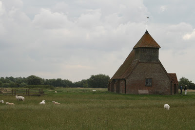
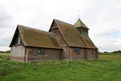
During the last few weeks I've been working on a proposal for a Chapel. The brief is for a wall piece and it has to cross between religious and non religious visitors as this Chapel belongs to a hospice.


I really enjoy projects like this as it gets you thinking and because of it's placement it has to be dealt with understanding and sensitivity. 


I've been looking at the idea of The triptych and how I could design a contemporary non figurative piece. 


The Triptych was usually an altarpiece sometimes hinged so it opens up very much like a book in order for it to be able to stand alone. Paintings again were in three parts and the idea behind the Triptych was it enabled a story to be told dividing it into the beginning , middle and end.
I also started to look and the significance of the number three and this also represented 
past, present and future. The triangle interestingly fits three interwoven circles inside 


"representing the unity of the three persons of the trinity" 


Life cycles
Moon phases 
Synthesis
Three is said to be the heavenly number which represents the soul.


So I had quite a lot to begin working with as well as deciding on the aesthetic.


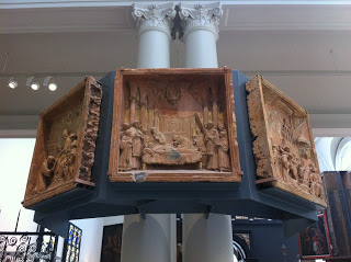
This is an example of a renaissance triptych in the Victoria and Albert Museum I was actually interested in how these sections had been mounted with small brackets at the base.


Image taken from www.theartdaily.blogspot.co.uk this is a fantastic blog it's well worth a look.

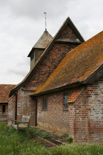
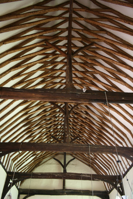
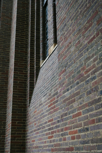
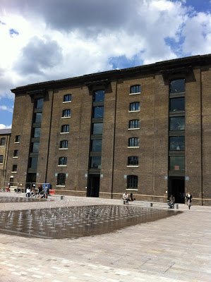
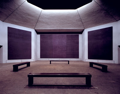
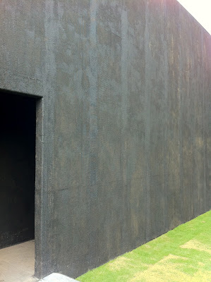
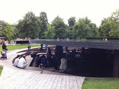
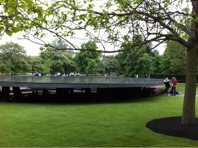
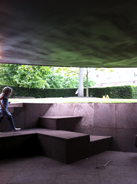
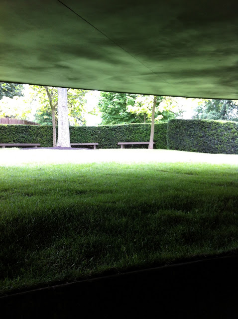
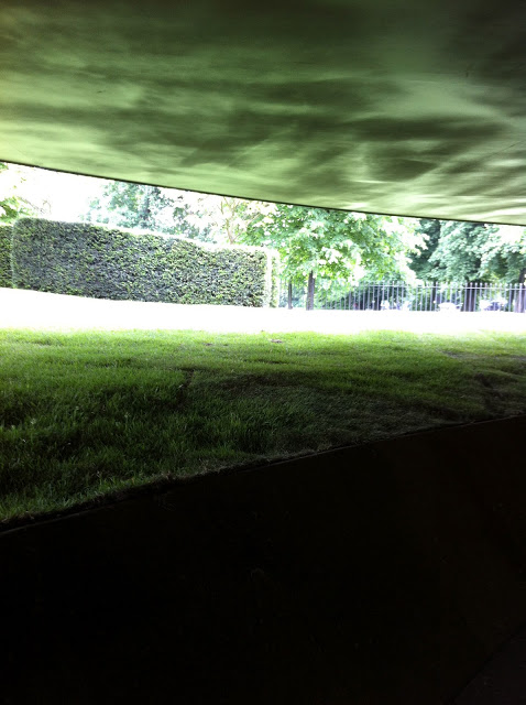
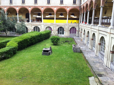
Rothko's chapel in Texas this non denominational church was the first image I began working with it's devoid of any detail decoration the seating is positioned in the centre of the space and I wanted to begin working not only with a simple aesthetic but it was important to me that what ever i designed had to function on a sensory or emotional level. Meaning colour, light, tactility, and simplicity all have to be evident and work harmoniously within the space.


photo© gilbert Mccarragher

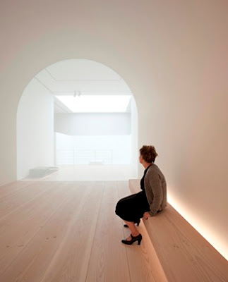
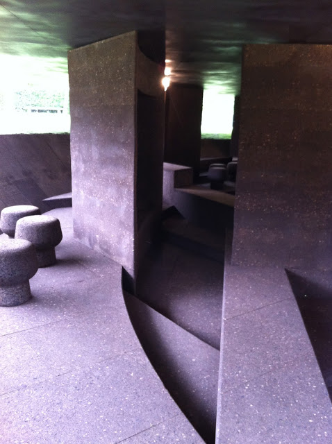
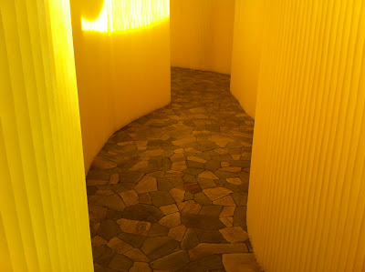
John Pawson was also another key figure in my thinking for the very reasons I've just mentioned. This Image was taken from the 'Plain Space' exhibition at The Design Museum in 2010.
By this point I knew that I wanted to work white on white and John Pawson's spaces are a fine example on this. white being introduced into a already bright space reflects the natural light with more power so I wanted to play with that idea.


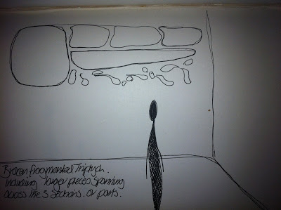
 I was interested in in moving away from the traditional idea of th triptych and framing it on the horizontal instead of the vertical.
I felt that it would be easier to read and visually would be more fluid within the space.

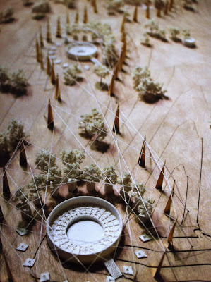
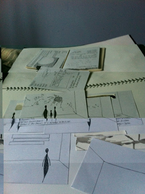
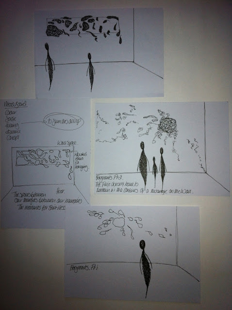
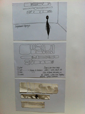
So i began the sketches mapping out several renditions around the idea of the triptych whilst considering different ways of constructing the piece I can't help but always begin thinking about realising the design. Knowing i will be making the final pieces it's wise to have that in the back of your mind during the design process otherwise you will be in for a stressful time later on. The deadline is the end of June so i'm planning to send this off in the next few days and see if I'm shortlisted.


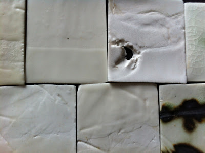
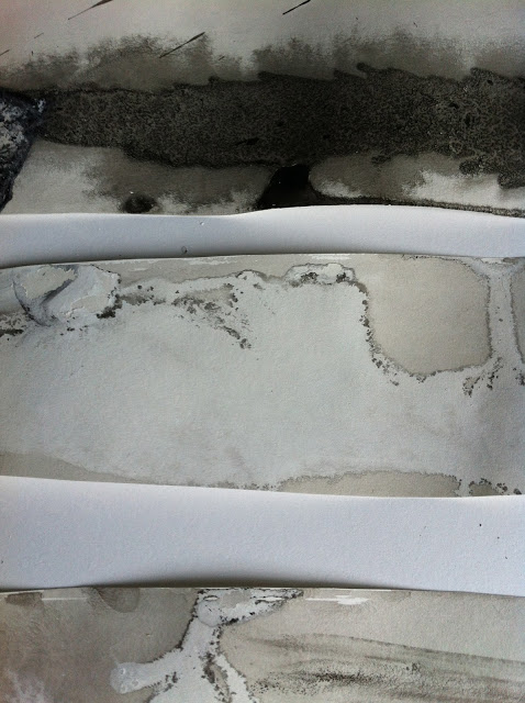
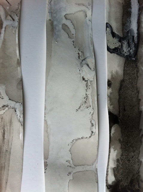
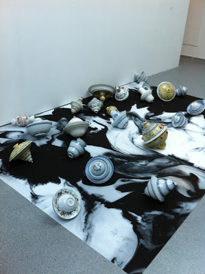
A series of glaze tests on porcelain and stoneware showing the range and variation of whites and creams. All glazes have been mixed by myself i never buy manufactured glazes as they don't have the same depth to them or interesting imperfections. 
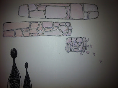
Initial ink drawings to give me an idea of scale and how these three pieces can possibly sit together i don't want these panels to be perfectly straight and even on the edges as it would feel as though i'm trying to fit them into a rigid confined space which seems out of context considering the work is there for visitors of different religions beliefs and cultures. it needs to be welcoming, calming, and all encompassing. 


And here are some design ideas i have been looking at.


Sadly I wasn't shortlisted the shortlist had been reduced from 10 down to 4 people and the one thing the panel was unsure about was how white on white would work. The shortlisted artists comprised of 3 painters and 1 stained glass artist. Nevermind it's another idea that can be filed in my folio for future work. Nothing is ever lost in these situations as ideas can always be pulled out quickly when you really need them if the ground work has already been done. 


    Serpentine Pavilion 2011 (Peter Zumthor)

    As I was on the subject of this years Serpentine Pavilion I thought it may be interesting to talk about Peter Zumthor's 2011 design. Not only because his work continuously fascinates and inspires me but I realised that I didn't mention it at all this time last year as I was right in the middle of finishing my project.


    This space unlike Al Weiwei's design  was rectangular from outside as you approached it what confronted you was a simple austere black box, which you entered through a door taking you around the edge of the pavilion through darkened passageways. At this stage there was no way you could know what you were going to be confronted with. 


    In some respects there are some similar elements between the two spaces. The darkness and the framed views. In Peter Zumthors space the framed view was the skyline with a clean cut in the centre of the roof allowing natural light to flood into the planted garden below.


    Around the edge of the garden was seating which felt fairly formal and structured. Unlike this years pavilion where visitors can be much more mobile in and around the space. The sensation of being embedded within the ground was simply an illusion due the angles of the roof. It's interesting how these sensations can be created as it makes you question your environment and how you feel during the time spent there.


    The saturation and darkness within the passageways before you entered the central core felt quite disorientating. The small dim lights didn't really help with navigation so it became very much about using your senses which Peter Zumthor always manages to achieve with success.


    For anyone interested in Peter Zumthor's thinking 'Atmospheres' is a great book! 


    Serpentine Pavilion 2012

    Opening a little earlier than usual I took the opportunity to visit the Serpentine Pavilion this weekend to get some descent images and avoid large numbers of visitors. 
    Designed by Al Weiwei, Herzog and de Meuron the pavilion is open until the 14th October and is always worth a visit throughout the summer. 


    This years pavilion space has been embedded into the ground. From a distance the first glimpse is a circular water filled form. From some angles this was difficult the see clearly but you are aware of subtle motions created by the different weather conditions and lighting reflecting from the roof.


    As you descend down into the dark cork lined area the scent of the cork lingers in the air and   adds to the experience or sense of being underground from above a circular roof appears to elevate almost hovering in mid air over the space. 


    As you enter the space the view looking out has been clearly framed very much like a landscape painting by the low hanging roof and line of the ground. You physically find yourself lower than ground level. This becomes more obvious and defined by the crisp grass line and the immediate change in light. 


    What I liked about the space was the interior had
     been designed in such a way you could sit anywhere. The multiple layers acted as walkways seating or standing areas. There were no restrictions on how it can be used or how you navigate your way through. 
    The bottle cork stools were the only clear indication of objects with a specific use and again can be repositioned to suit. The use of cork was interesting as it had been laid like tiling or brick but the surface was incredibly tactile, edges had been rounded and there were some great angular sections creating this sense of intrigue as you walked around and through.


    Clerkenwell Design Week and The Chelsea Fringe Festival


    Last week Clerkenwell was heaving with visitors for the design week events.
    The Farmiloe building was the first point of call as that's where you had to collect the wristband to enter the event but it's always a pleasure visiting this space because it always looks different.
    Having exhibited here last September with Designersblock for London Design Festival I instantly felt very much at home. The one stand that immediately caught my attention was Johnson Tiles working with Material Lab.


    Johnson Tiles based in Stoke on Trent take broken faulty fired ceramic waste from Stokes's ceramic manufactures and recycle it back down to create glazes for their own production.
    Any one who is involved with ceramics I'm sure will be not only interested in this process but also excited to see that this large quantity of waste is no longer going to landfill as once fired ceramics can never biodegrade. This has been a concern of mine for a long time but it also means as a ceramic designer myself I can also utilise this service and send any waste created in my own studio up to Stoke.
    For anyone interested all the information can be found on their website. www.johnson-tiles.com and Material Lab are based in London www.material-lab.co.uk


    Running along side Clerkenwell Design Week was Chelsea flower show and the Chelsea Fringe Festival.
    Just around the corner on Charterhouse Street is The Garden of Disorientation installed for the Chelsea Fringe and will continue until June 9th. www.chelseafringe.com
    This space was an old meat packing warehouse and has been transformed into a relaxed space filled with Mint designed by Deborah Nagan. We arrived first thing in the morning so felt it was probably too early to try one of the Cuban Mojitos on offer there.


    Over in Portobello Dock was the Dock Garden Festival where you are immediately confronted with a piece of work called The Floating Forest by Nippagesage where a series of a 1000 sliced tree trucks are floating in the canal. What I liked about this piece was it's positioning directly in front of the Dock shop so not only could you experience a different perspective on another level but from the outside the reflection in the glass made you question where this piece of work began and ended.


    Pinterest

    In the last couple of weeks I've not only joined Twitter but now I've discovered the world of Pinterest. How fantastic this is for sorting out your sometimes muddled thoughts. An online pinboard is a genius idea it not only enables you to gather images but it saves having to print loads of photographs and stick them into a sketch book. I'm not saying it will stop me working in such a way as this process is so deeply ingrained within my practice but you can build an overall image, idea or mood very quickly this way. 
    Take a look at what I've gathered together so far the Monotone board is coming together rather nicely and sits well with the Black images I posted last year.


    Twitter

    As you will be able to see I have finally decided to join Twitter.
    Now I've made the leap I don't know why I've been so slow on the up take. You will be able to follow me from my web site shortly.

    Milan Furniture Fair Favourites 2012

    Here are a few examples of the stand out works I saw during the Salone del Mobile. My focus during the show was based upon colour sound and experience. The works hi lighted here are designed spaces that have been created to evoke an atmosphere or emotion.
    There was so much to see during the week it was impossible to travel around and catch everything particularly when you are exhibiting yourself. Sasha and I decided to try and get around to see other shows in the mornings and spend the rest of the day over in MOST.


    In Cloister two Molo design a collaborative design and production studio from Vancouver were exhibiting this temporal space that was specifically designed for the museum space. In the centre of these panels a sound system was embedded creating a soft enveloping wave of ambience combined with this incredible vibrance resonating from the yellow walls. 
    The moment I encountered this work I knew I would be revisiting several more times during the show. It was interesting to see how the work changed with the extreme change in the weather conditions and light. It felt like a small haven.... what ever seemed to be happening in and around the cloisters Molo managed to instantly slow you down and I wanted to savour this experience as I  encountered the space. 


    Moroso was hosting a project designed by the Chinese architect Zhang Ke called Hidden Dragon. The space was flooded with red lighting and the central room opened up revealing a series of screens hugging the edge of the room with lucid black ink brush marks. 
    In the centre was a large red upholstered seat. Designed to sit alone or together to recline into the seat and for several people to sit separately but still be able to engage in conversation.


    Studio Toogood at MOST


    La Cura Studio Toogood 

    I managed to visit La Cura on Sunday morning the last day of the show. It lasted around half an hour and I managed to slip into the room at the very last moment just as the performance began. 

    The 40 chairs were positioned around the edge of room each one had been wrapped in different materials symbolising protection the view into centre of the room focussed on the pavilion. 

    Obviously the evidence of clay was my driving force for attending as well wanting to see how successful this space or environment that had been designed to force you to stop or slow down. 

    I was filled with intrigue surrounding not only the space but the aesthetic the atmosphere, the sound and once fully immersed in the experience I was blown away....
    It had to be a combination of everything the lighting the sound the ritualistic nature of the piece there was a distinct Japanese feel in both the colour white and simplistic tools used. (Zen gardening instantly came to mind !)
    The sterile clean functionality of the enamel bowls and trolleys used to present the clay the pace at which the performance unravelled always hinted at slowing down and to take a little more time.

    There was a specific language attached to the entire experience 'the caretakers' 'the cures' 'the garden' 'protection' 'dressing'
    It hints at modern day healing or spiritual healing. Designed for the senses as opposed to the physical although there was a physical aspect attached to the experience. Engaging with the clay a material that can often be associated with school as it's normally one of the first materials children tend to use due to it's ease it's a welcoming material that brings people together in the sense that is impossible not to make something it can be rolled flattened squeezed moulded it doesn't have to represent any kind of form it can be used as a tool to simply communicate a emotion or mood. In that respect it was interesting to see how others were responding to the material. At this stage it became very instinctive some people touched it with hesitation others were straight in. As a ceramic designer this process was like second nature to me however, I was wondering whether I may have been too precious because it was familiar compared to those who have had little or no contact with clay In the past. As the week progressed the small clay cures were carefully and respectfully taken away and added to the garden making a large scale installation or sculpture.


    Lighting Installation in Zona Tortona.
    It'a magic take a look...