Set up for Salone del Mobile 2012


Sunday set began early in the morning at MOST and continued through to until 8pm
it turned out to be a long and exhausting day I don't know how we managed to stretch the day out to a 10 hours.
The venue was beautiful Designersblock took place in one of the two cloisters within the museum. 


Lovely Wood by Sam Sheard www.samuelsheard.com


Sasha's bio fireplaces www.essenceofflame.co.uk


My final set up... it's always difficult to convey the scale of my work through models therefore photographs and slideshows are always really important for visitors to gain more insight into the entire working methodology.


Preparation for Milan Furniture Fair 2012

It's a week until Sasha and myself leave for Milan Sam will be arriving on the Sunday.
All the work left from Designersblock on Thursday so I'm just preparing the last pieces of work that will travelling with me. I think it's important to show these mortar samples Pause was reconstructed with coloured mortar these were the shades available to choose from and will be  positioned next to a sample of the cheddar red brick to give a clear visual reference of the final aesthetic.


The last model I want to include is a white and black model to show a contrast next to the dense black models that began at the beginning of the research.
This body of work is being showcased not only to document the progression of thinking within the research but also to understand how the working methodology can be moved forward and directed into future projects or further research. 


The Workshop Guide to Ceramics


The Workshop Guide to Ceramics written by Duncan Hooson and Anthony Quinn has just been published by Thames and Hudson. 
This is a complete essential reference book for anyone working within ceramics. It feels clean fresh and contemporary with some fantastic visual reference material to accompany the text.
Two images of my working models appear in the model making chapter.
Four of my working colleagues and friends Sasha Mazur-Knyazeva, Nicole Mueller and Naomi Bailey and Leo Richardson all appear too. 

Bloom Skin Issey Miyake


This window installation Bloom Skin for Issey Miyake appeared on www.designboom.com a couple of days ago. Designed by a Japanese company called W0W specialising in design advertising installations and exhibition spaces. This very simple idea using fans and thin fabric creates a striking poetic visual piece spanning a 16m space. W0W aims to create art and design together. 

'To design and create Sensational, yet timeless work that is free from fashionable trends' www.w0w.co.jp 

This piece of work along with another Japanese designer Tokujin Yoshioka here is one example of Tokujin's work called Snow sensing nature 2010 again a sizeable piece of work filling a 15m gallery space and a perfect example of a experiential piece. Both works caught my eye for several reasons. Firstly the minimal aesthetic provoking quietness, secondly they both capture a certain element of interaction through gentle kinetics and thirdly there is a strong emotional pull to both works you feel yourself being hypnotically drawn in.  


I think what I'm building up to here is the sensitive subject of Art vs Design......
Is there a clear division or should labels even be used when trying to define a creative practise or process? This was a question I touched upon whilst writing my Thesis. Bloom Skin has been designed yet place it into a different context it could be viewed as a piece of art. as a designer I get a little fed up with these assumptions that design has to be purely functional without any emotional attachment or impact I believe that there is a fine line between art, design, architecture and craft and will be returning to this subject shortly.

Chihuly at the Halcyon Gallery

I popped into this Exhibition at the Halycon Gallery on New Bond Street on Monday with Illy. www.halcyongallery.com
It turned out to be one of those hidden gems you stumble across. The gallery itself was a complete surprise it opened up into this intriguing space divided into several rooms and basement including what looked like a vault or old safe large enough to walk into, and a small room sitting at the top of a stunning staircase which faced you as you enter the building.
Scattered between original architectural features was Chihuly's glass installations.


By looking at the two Chandeliers sitting in the Bay windows from the outside you have no idea how extensive the exhibition is going to be.

I'm going to briefly talk about the three key elements I felt were important running throughout his  work shown here.

Scale
Shadows
Colour


Scale 


Anyone who is familiar with his work I'm sure will agree one of the first questions that come to mind is the sheer weight of one piece and the huge undertaking of transporting a body of work such as this. It makes me anxious just thinking about it. 
The scale of some pieces are made up of multiples which ultimately allows larger pieces to be made and constructed more easily, there are also several pieces of a sizable scale made from one piece of glass (see image 1) in these particular forms there is a clear fluidity The transformation from a soft mailable material when hot to a static hard material once cooled these forms are immortalized in an  illusion of motion captured throughout the making process. 


Shadow


Shadow is very often something we consider to be dark here we see these brilliant shadows being cast through a transparent or coloured surface which reflects and abstracts not only the colour but also the patina or surface finishes on the glass forms, It gives the impression that the form is stretching out beyond itself.This can be malnipulated by the light and the placement of each piece. Chihuly's work has an abililty to fit into many different contexts by framing the work in such a way allows it to be seen seen or understood differently. By framing the work within a slightly darkened room creates a different mood compared to being outside where sunlight is constantly changing and spotlights do not exist shadows would be cast according to the wheather.
By viewing the work within the a gallery those pieces are seen within a constant state and their placement has been carefully considered.

Colour


Colour within glass has gone hand in hand  for many centuries predominately used in stained glass windows and I think we have become familiar with glass being used as a tool to tell a visual story within the context of Church design but what I find fascinating is it's transparency almost as though it's been used to convey the truth because there's no possible way of hiding or concealing imperfection.
Chihuly's use of colour pushes glass into a completely different realm he creates sculptural abstract landscapes and certainly doesn't shy away from colour it is used and applied with utter conviction and confidence. Transparent surfaces sit next to opaque pattern and cut surfaces resembling crystal all of these details need to seen close up to appreciate the level of craftsmanship. There are hints of the influence of Murano glass here with subtle application of metallic and gold leaf

Downstairs sits a collection of more traditional vessels forms, slightly subdued compared to the work upstairs where monotones are used to frame a series of pieces layered with what may appear to be drawn marks. Personally I loved this collection maybe it was something to do with the fact that resemble porcelain.... But I think it was the way the marks reflected through to the internal surface. It meant that the pieces were intended to be seen from every angle not just from the outside which is often the case with the vessel form. 

The exhibition is on until 31st March 2012


My Favourite Card


My Favourite Christmas card of 2011 was given to me by Bessie Kirkham a talent in the making at 9yrs old.
Already showing a strong individual style of drawing but also a clean contemporary characterisation which can be applied to illustration art and design projects in the future.   


The Truffle/ Ensamble Estudio

I've been meaning to talk about this piece of architecture for a while now as I first fell across it June 2011 and was blown away not only by the final outcome but the processes involved in constructing this impressive small scale space. The images used belong to Roland Halbe and Ensamble Estudio


The Truffle was designed by Anton Garcia- Abril and sits in Costa da Morte in Spain overlooking the Atlantic Ocean. A project spanning 4 years for a relatively small space brings me to the processes used during this time frame, hi lights that a project such as this really needs time to bed in to the landscape in which it sits.
This concrete structure was made using bails of hay stacked in such a way to create the internal space forming rooms. Concrete was poured on top of the hay and left. Now this immediately fascinates me because the making and building techniques are fairly simple and yet the processes involved also immediately inform the overall aesthetic for the final piece.


This organic form could give the impression that it has been built based quite instinctively. I believe for such a hands on project it would need a great deal of careful consideration and precision design decisions in order for this to work. I love that there is a rawness to it.. The marks not only made from the imprintations of the hay but also how that sits and balances with the sharp cuts at the front used to create the viewing window. 


This looks very much like stone being removed from a quarry. The scale of the concrete and the marks left from the tools being used are all important factors and it is in these details I was instantly drawn to what what was achieved.  


In this image the process becomes even more intriguing! It is evident for the first time to begin to understand what the interior space will look like and how it's going to work as a space however, the calf played an integral role here. Paulina was introduced to the space in order to eat through the hay and clear the internal cavern that way nothing was wasted. This process alone took a year. I'm so impressed by everyone's patience however, the passing of time would have also allowed the structure to settle. It's always interesting to see how the changing seasons and weather conditions affect our own perception a piece of architecture or a space such as this. 

I'm going to finish with some interior shots of the finished furnished space.
This project can be seen in more details on www.knstrct.com  and www.archdaily.com


It's remarkable to see concrete being used in this way, it has similar qualities to plaster in the way it can capture every small detail. Concrete in the past has often been associated with post WW11 brutalist architecture and functionality. Although this is a material currently being used within all areas of contemporary design particularly within furniture design it is bringing a new sensibility and understanding of material qualities  

Christmas Window in East Dulwich 2011


Several months ago I agreed to design a Christmas window scheme for Karavan on Lordship Lane in East Dulwich. http://www.karavan.co.uk/ The store specializes in Eco products therefore I wanted come up with a design that was fairly simple but also focuses attention to the products being shown within the window.


I began with the idea of concentric circles or interlocking circles it was really important for the design to look as though it had been hand drawn as a perfect digital print I felt would not convey the individual image of the store. 
Originally I thought about having circles that were cut out so light could be positioned within the the store to reflect the design out on the the pavement. The first image at the top of the page was a small test piece.

I also had to work with two windows and a door positioned in the Centre. I wanted to pull the entire space together by incorporating the whole design across all three panels instead of having a symmetrical design which I felt would have been too obvious and frankly a little dull.


Colour was also important and once again the colour scheme had to create a narrative with Karavans ethos.
White was always key colour as it reflected the simplicity of the overall concept and once the design was scaled up to 1.1 scale there is an ambiguity to the piece. I didn't want it to shout out as being obviously Christmas but more about a winter window. So many options were considered firstly metallic either pewter or copper .... Black was too harsh and I very quickly moved away from traditional Christmas colour options such as red green gold and decided to go with gunmetal. 


So the final outcome was a vinyl printed image spanning the three spaces creating this slightly cavernous feel as you look into the shop. Xpress printing http://www.xpresssigns.co.uk/ on Goose Green printed and installed the final piece and Rachel Russell http://www.hellowilson.co.uk/ who also designed my website helped rescale and format the final artwork to go to print.


Light


Here I have chosen a series of images that I have collected concentrating on light particularly focusing on light and space in much the same way the previous post looked at the colour black.
Both of these images were taken at the Victoria and Albert Museum last year at an exhibition called 1:1 Architects build small spaces. This structure was a 1:1 scale reconstruction of a house in Mumbai made from plaster inhabited by eight people.

It's difficult to understand the scale of this piece considering eight people lived in the original structure. The corridors could only fit one person at a time the rooms were compact and confined several people would be sharing the same sleeping areas. However, the quality of light flooding in to this space was wonderful and that was only within the gallery space inside the V&A imagine what it would have been like within it's original context in Mumbai.


 Chaumont Sur Loire Garden Festival September 2010 
Both images were taken on the same day it was glorious and the sunshine gave an interesting quality of light creating these hazy reflections and shadows.


I wanted to include this image image taken on a misty cold November afternoon in London. Light doesn't have to be bright it's often how light creates an atmosphere and it's during times like these that a particular time or atmosphere is most memorable.


Black


'Black has almost inescapable traditional symbolism as the colour of darkness, negative forces and unhappy events. It stands for death , ignorance , despair, sorrow, and evil.
In superstition black is synonymous with disaster, black cats black days. As the colour of mourning it dramatizes loss and absence. '

The complete dictionary of symbols in myth, art and literature. Editor Jack Tresidder


It's interesting how colours are attached to symbolic references or meanings. 
I'm not incorporating any conventional associations in my approach to the colour black. 
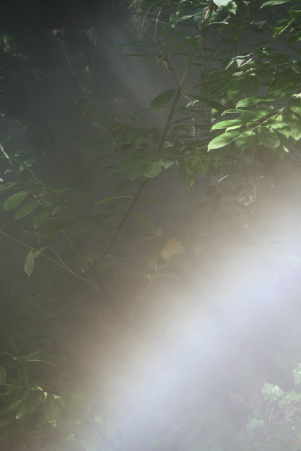
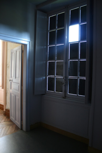
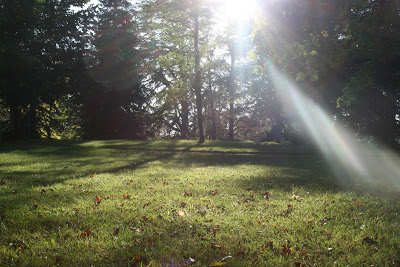
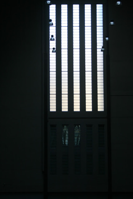
I'm more interested in how light and dark visually work together. The strength and intensity black has particularly on a large scale, spanning spaces. 

How a dark environment can be transformed when floodlit with sunlight. I'm aware that light also has strong symbolic connections but that is another conversation .........
Blackness...... darkness....... what do we see in darkness? what do we think we may have seen ? How does a lack of light make us feel?


I have this fascination with the colour black at the moment, well 
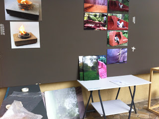
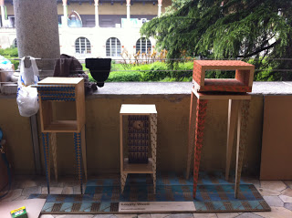
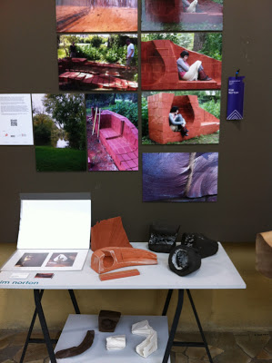
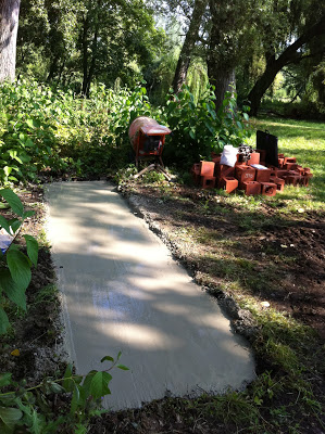
I say at the moment. It really began at the beginning of my MA when I discovered this incredible black clay and started working on small models I have a few examples of these pieces past and present, including a few more images I have been collecting along the way.


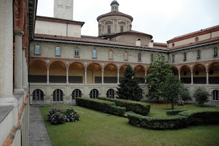
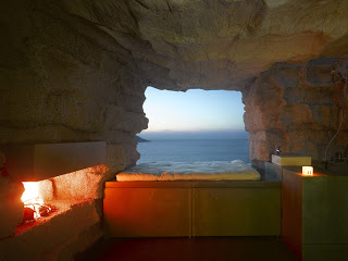
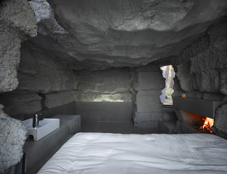
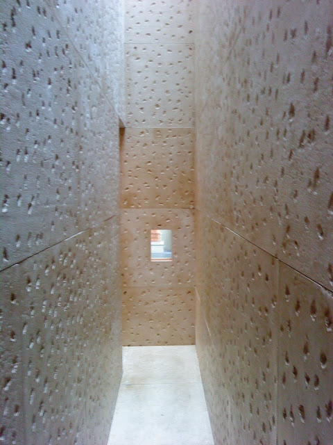
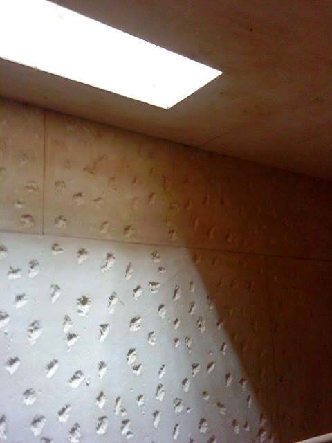
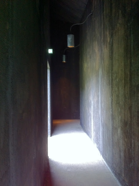
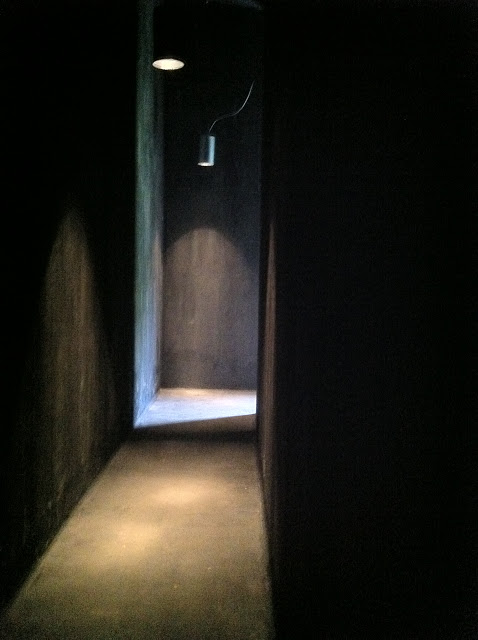
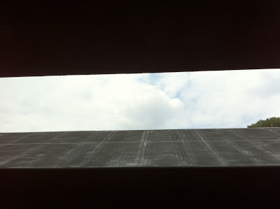
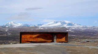
Here are a few images I took of Peter Zumthor's Serpentine Pavilion 2011. The saturation of colour was quite intense considering how bright it was outside that day. That's what I adore about these relatively small spaces. Once inside you are fully immersed into these experiential environments. What ever you experience within the confines of these small spaces you cannot fail to feel something. With the turn of each corner came this unusual feeling that the walls were closing in on you in much the same way certain Richard Serra's pieces do but that's normally the angles at which the walls are standing. This was very much about the quality of light within a narrow passageway.


This was the first experimentation with black clay during my early findings and explorations at the Victoria and Albert museum residency. At this point I was interested in light and dark contrasts and marks.
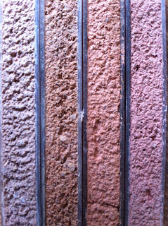
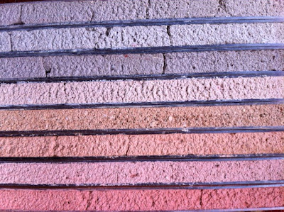
Here I have three different clays that were watered down to a slip consistency and poured onto a plaster bat in thin layers building up the surface over time. It was so fragile but i was interested in canvas looking sheets with the idea to have them suspended on a huge scale.


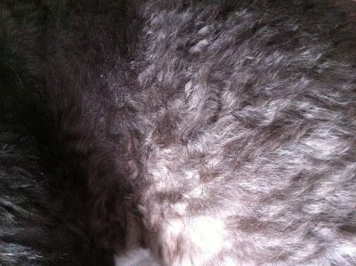
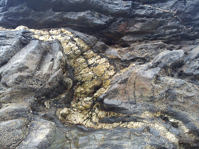
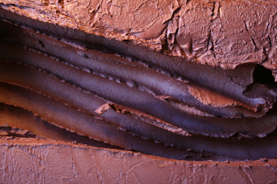
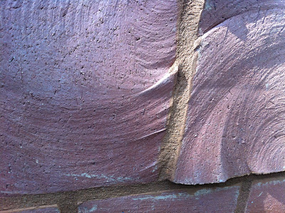
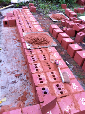
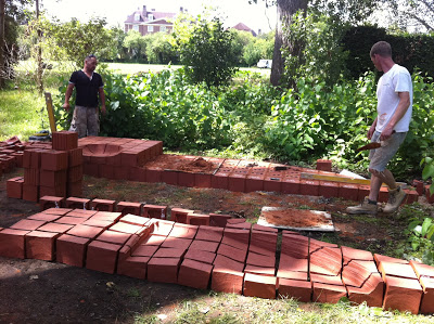
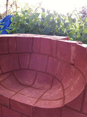
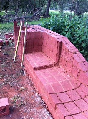
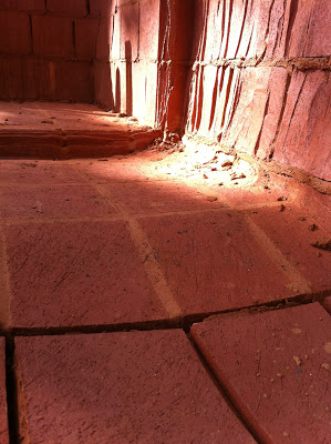
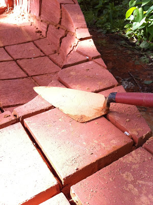
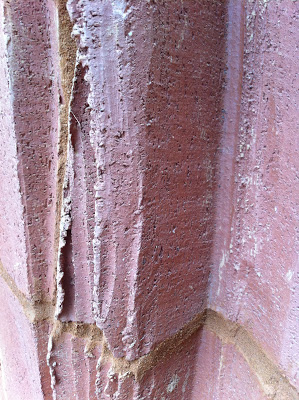
Cape Cornwall where natural black clay can be dug from the ground although once fired it's slightly purple in tone.


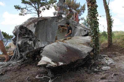
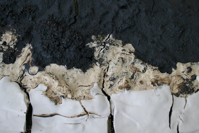
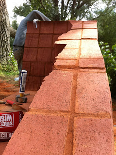
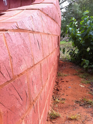
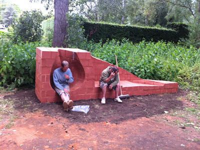
It's unusual to have an explosion in the kiln I think I've only had it happen twice in my 15years of making. However about three weeks ago I had quite a spectacular mess awaiting me when I opened the kiln. I had a large rectangular carved piece. It was really heavy and thick, although I had been drying it over three to four weeks and fired so slowly it must have still been a little damp in the middle which was impossible to tell given the size of the piece. Here are the pieces left and currently sitting in my studio which triggered an idea for a possible project Sasha and myself are currently working on.


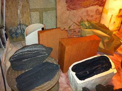
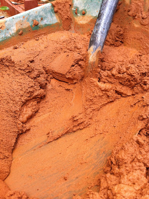
Unfired black clay in this state it looks very much like a darker terracotta


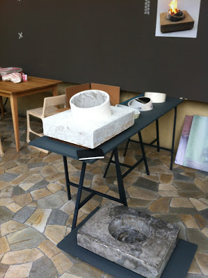
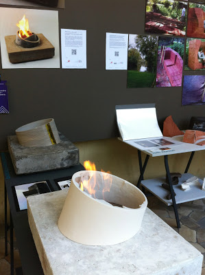
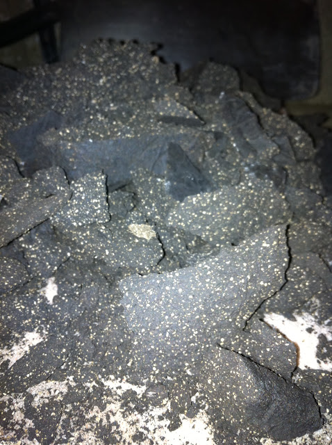
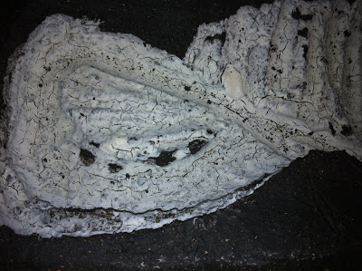
 This is the transformation after firing i took this up to 1260 oC and have returned to the black and white contrast. Until I go ahead and design a full scale black piece of work I think I will continue to this slight obsession with the drama these two opposing materials create together.


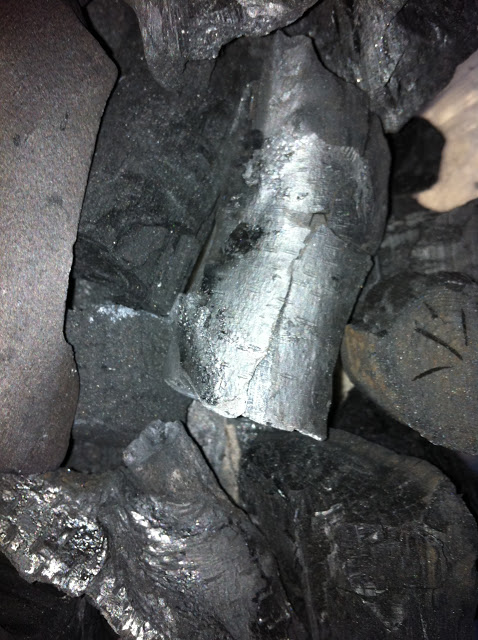
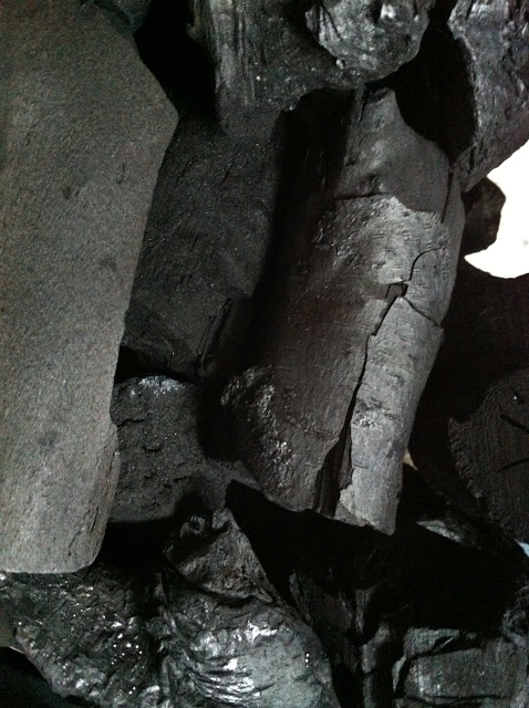
This was some of the charcoal Anne and I used for the Bond Street window display back in May. We selected it as it came from English Coppice woods the pieces were still intact as entire branches the bark in some cases were also still attached but had turned this incredible silver shade.


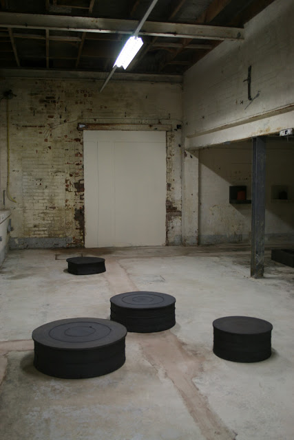
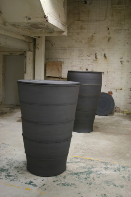
 Julian Stair's new works being shown at the British Ceramics Biennial in Spode. I had to include these for several reasons containment and scale although the work is completely different and more traditional in form, in so many ways I felt that the ideas based around encasement and being contained was also close to some of my own thinking.


British Ceramics Biennial Opening Night 2011


Sasha and myself arrived in Stoke on Thursday evening for the opening night of the British Ceramics Biennial. It opened to the public on Friday 30th October.

We entered the Spode factory from the Kingsway entrance to find this fantastic hot pink which is running throughout the entire event. Normally I'm not a fan of pink but somehow it seems to work here.


 Spode is Hosting Fresh and REfresh exhibiting recent graduate work and Post graduate research. (Here's a glimpse of my material research shown as part of Refresh)
Throughout the central space there is also The Great Wall which can be seen in the above image showcasing some of the big industries involved within ceramic production ranging from Tableware to Brick.

In the far room work from EKWC is being shown it was in this room I found what I considered to be the strongest pieces of work it left me completely inspired. David Rickard's 'Testflights'  the processes involved the scale and the unpredictability of the work was outstanding. The images below show what originally began as large balls of clay lifted from the ground using a crane and dropped from varying heights. It's fascinating to see the result of work that has been handed over and surrendered to the process involved. It's refreshing to see such work that has a raw energy and lack of preciousness which is often lacking in alot of ceramic work. As ceramicists can often be preoccupied with trying to control this material far too much.


We also bumped into a few fellow Central Saint Martins faces


London Design Festival 2011 Designers Block


1st day of set up
801 Designers at Designers Block Farmiloe Building Clarkenwell


Furniture
Anne Frobeen 
Nilou Afnan
Elena Nunziata
Sam Sheard

Ceramics
Kim Norton
Alexandra Mazur-Knyazeva

Jewellery
Robert Logan

  
We are a group of Central Saint Martins Design Post Graduates unified by three disciplines furniture ceramics and jewellery 7 members of 801 Designers were showing at Designers Block during London Design Festival. By working together as a group allows us to have a presence at the larger shows.


Opening Night Wed 21st September


Kim Norton Experiential Space
Models and working processes were shown along with photographs and a slide show outlining the making and installation of the final design


Nilou Afnan
Nilou's research project derived from a photography project in Beirut.


Sam Sheard
Lovely Waste Sam has be exploring how pattern can map the making process


Alaxandra Mazur-Knyazeva
Essence of Flame
Alexandra has designed a portable bio fireplace to fit into contemporary homes and interiors.
Part of her research involved examining our emotional attachment to fire and the role of the fireplace within the home.


Elena Nunziata
A collection of children's furniture designed to aid learning through interaction with the objects.


Kim Norton


Anne Frobeen


Robert Logan


During the four days at Designers Block I met some really interesting people and this was the first time the project has been seen outside of Central Saint Martins so feed back is always so important and fascinating.
However, I believe the valuable experience has been how designers from other disciplines and industries view your work.Simply by some of the conversations i had throughout the show I came away with a broader view of where my practise could go other than large site specific installations and commissions. Moving the work into a different context and (when I say that I mean design as opposed to specifically ceramics) brought a broader spectrum of ideas relating to particular aspects of the research and comments on how that could be applied or translated into architecture or industrial design.
The tactile qualities within some of the models and markmaking created through cutting the clay were prominant comments within many of the conversations.


British Ceramics Biennial 2011


Yesterday I travelled up to Stoke On Trent to deliver work to the British Ceramics Biennial.
I will be exhibiting at FRESH within the old Spode factory only a short walk from the train station for those of you wanting to visit.
I am one of the six research graduates selected to exhibit and can be found under REfresh.


Here's a glimpse of the enormous space within the bare bones of what was once a thriving hub of British pottery production and fine bone china. It's always interesting to gain some understanding of the vast amount of work that goes into hosting a show of this calibre.

This was the space a couple of days ago whilst the contractors were still on site working. Work was beginning to be installed but it seemed to be mostly wall mounted pieces. The freestanding works are being shown on the original features such as benches and racking. REfresh are having floating walls in order to divide the spaces into individual contained units allowing the body of research to be seen with more clarity.

 I can't wait to see the transformation on the opening night.


Tverrfjellhytta Pavilion Norway

Two days ago I fell across this fantastic structure in Icon Magazine.Tverrfjelltytta Pavilion in Norway it has been designed as a viewing platform for wild reindeer.


There are so many elements I love about this piece which is echoed in my own thinking. Creating an enclosed space in such a vast landscape seems to heighten ideas of seclusion and encasement as there's no where else to go. However, my fascination really lies in how we go about creating an atmosphere within a relatively small space as it's swallowed by the surrounding landscape. 


My immediate response to this work was there was a visual similarity with my own project Experiential Spaces. It's aesthetic is more organic and i think the very nature of building this seating area with wooden components instantly feels familiar. As the dividing lines throughout the piece will always change the overall appearance. Scale is easier to manage if the form is built in sections however, I'm not saying this is devoid of technical difficulties or challenges because large structures always have structural issues to overcome. CNC cutting has been used to create these fluid curves which is a process I researched during the design work for Pause using brick but it turned out to be too complex for the amount of time I had. It's still a process I'm wanting to explore further for a future project. 


Zaha Hadid 

This wooden seating/table or urban furniture was shown in Cavour Square in Padua in 2009 measuring 20 meters long. Once again this piece of design is an example of using a material in a less conventional way built in modules and carved from a solid mass.The reason for including this image is to show how unusual and less structured forms can be produced particularly on a large scale. There is an element of visual simplicity which is of course always difficult to achieve with success.

Pause being installed


The installation process began Monday 1st August in to Lady Margaret Hall's garden in Oxford.
After several weeks of slightly stressful organisation. Having to synchronise all the materials and machinery on site in order to begin work. I was surprised by how smoothly everything ran throughout the entire process with only a couple of minor hiccups. 

However, throughout this journey I have nothing but praise for all the companies and industrial contacts I have made. Everyone involved has been so supportive offering advice donating materials and showing a genuine interest in seeing this project through.

As the final design is installed in Oxford I wanted to involve local companies


Material sponsorship came from Tuckwells www.tuckwells.co.uk and Blanchfords www.blanchford.co.uk in the form of concrete for the foundations and cement, lime for the mortar.

It took a couple of days for the concrete to dry before the bricks could be laid which gave me a little more time to transport all the bricks from Ibstock in Bristol to Oxford. There were five palettes in total and the overall weight was approx 4 tonnes more than i had expected despite having done my calculations before the firing. This resulted in two separate journeys from Ibstock spread across three days.


Once all the bricks had arrived safely they needed to be placed in order of layer and number. This made the process alot easier when it came to laying the bricks. If you imagine every brick is completely different in size and shape it was very much like a life size jigsaw puzzle.


Friday end of the first day of construction........... 
Darren, Pete and Dan of Creative Brickwork Oxford www.creativebrickwork.net


Monday 7th August
It was good to have a few days rest in order to allow the mortar to dry properly before adding more weight.
As I anticipated the open seating was fairly straight forward it was the secluded space that proved to as difficult to put back together as it was to build in the first place.
There are several bricks in the right hand curve with barely any base to support itself. Therefore a mini scaffolding system comprising of stacked bricks and little help from wire and mesh to hold these pieces in place long enough to dry.


 Here are some detailed sections within the design it was really important to me to have  continuity throughout the mortar. These strong lines which are integral to the piece had to be followed through. Fluidity has always been a main consideration from the very beginning of the research deriving from the large ink drawings.


The final piece my plan is to leave it a few weeks in order for the grass to recover and regrow and then begin to think about a small press launch.
It's a strange feeling I have lived with this project for over two years now it's finally reached it's destination and no one has seen it yet. It feels like a large scale secret waiting to be discovered!